Clients struggled with completing tasks through the CMS. The areas of most difficulties for users were identified as follows. When editing pages the user had a small editable workplace which was difficult to see.
Clients struggled with completing tasks through the CMS. The areas of most difficulties for users were identified as follows. When editing pages the user had a small editable workplace which was difficult to see.
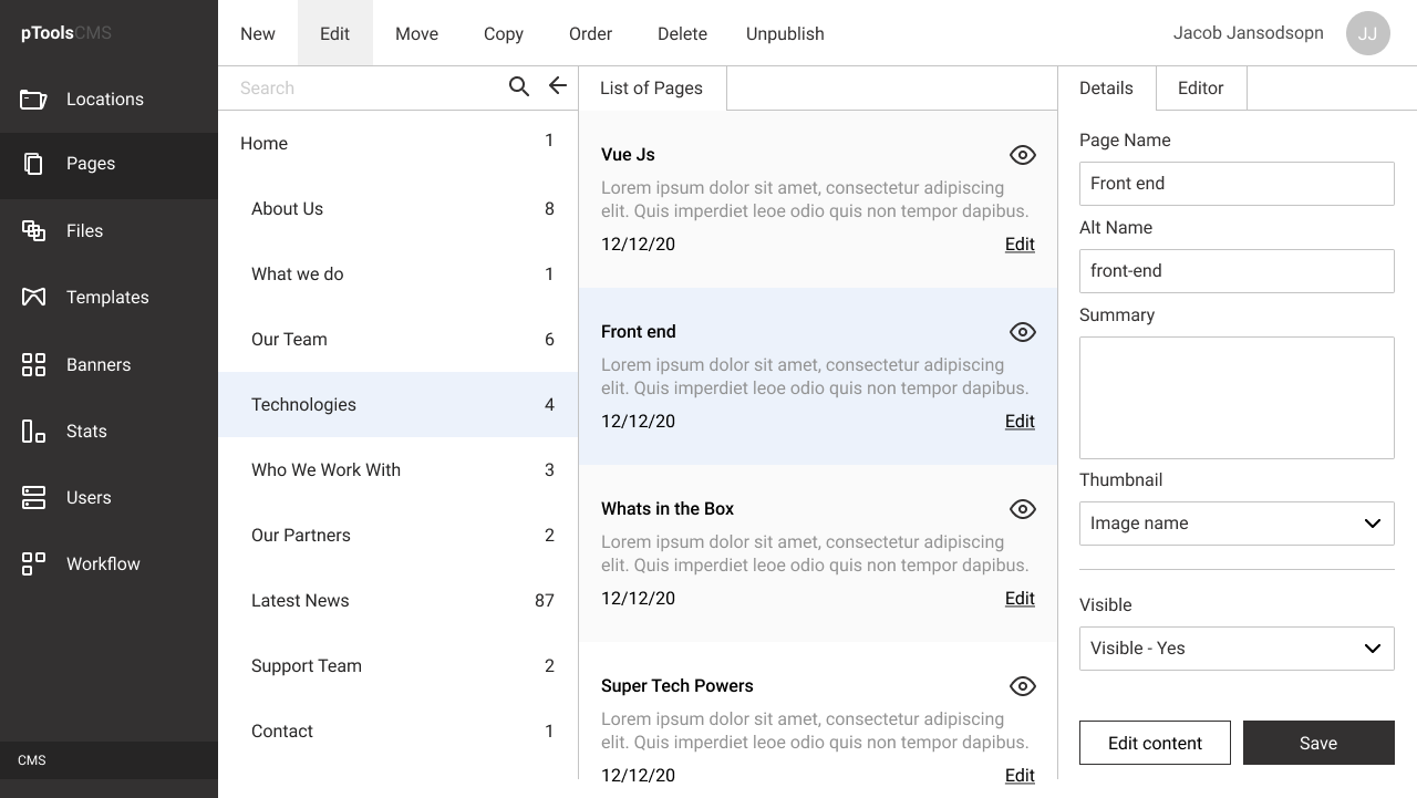
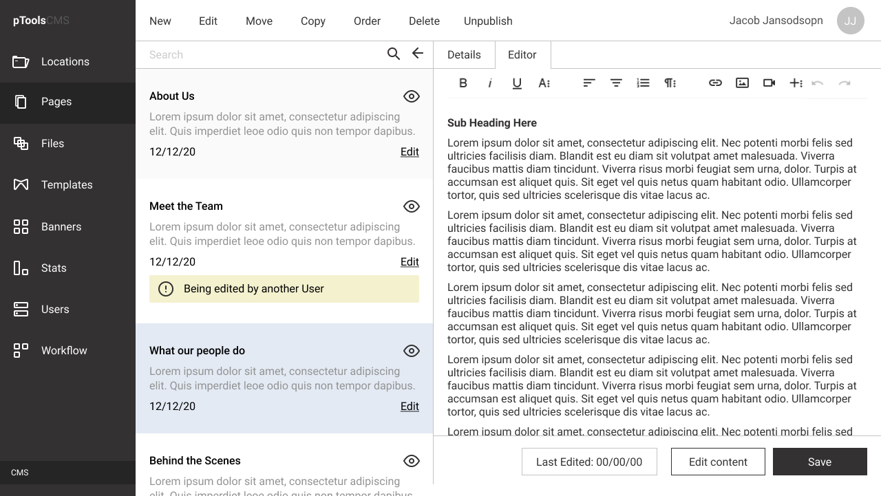
Visability of some sections required attention as many sections were hidden or required multiple 'clicks' to access, items of high priority did not stand out and were difficult to locate. The general site structure, were most tasks were based off, required a redesign of raccesiblity purposes. Although many of the processes were simliar for most tasks, they could have been made simplier for first time users. Navigating to an item through the site structure had limitations because it wasn't visable immediately and finally the language used within the CMS required editing as clients found it unclear (certain items used overly technical language which first time users may not understand). Changes Made: Edit Pages - The working space for users was increased. This gave greater priority to the editing area for the user to interact/engage with. Visability - Some CSS stylings were reduced. This allowed more space to emphasis high priority areas. High Priority - Within the table listings area, the text editing area was increased in width and height to increase usability. Site Structure - Upon landing on the CMS, the site structure was expanded from the landing page. This was adjusted because most tasks orientated around finding locations and editing pages within the landing page itself. Processes - The search dynamics was increased on the CMS to assit the user in finding locations, pages and files with ease. Navigating - The site structure was designed to expanded as the user landed on the locations, pages or files. This helped the user to identify the 'active' section of the CMS. Language - The language used to identify sections within the CMS was simplified to 'user firendly' terms. This allowed for a first time user to comprehend the functions of the CMS with greater undertstanding.
The aim of this project was to create a CMS that had increased usability and was more efficient for the user to complete tasks. Active areas of user interaction needed to be prioritised throughout. Using a consitent navigation and working process was required to help the users complete tasks in a timely manner. Creating a familiar process for the different functions would aid in the users experience and increase productivity. I began by designing wireframes based on the most common tasks carried out by users.
I tested internally using online tools e.g. maze to see if the wireframes succeeded in accomplishing an increased usability. After the initial tests of wireframes validated our assumption I began to create mid to high fidellity mock ups. Colours and different tones were then introduced to emphasis improtant and clickable areas of the CMS. From here a structural foundation was created were the remaining build of the CMS could begin.
Learnings Eliminating overstyled elements of the CMS helped to make the CMS more accessable to first time users. Although we couldn’t change the terminology of many items due to development legacy issues. However the editing and creation process was improved for the users. This was achieved by increasing the editing area and width to allow the user to edit distraction free. During the research phase of the project using task analysis was an excellent too that helped to provide live feedback on all aspects of usability.
I was able to identify recurring issues that obstructed our users successfully navigating their way through the tasks assigned. Of the concept development and prototyping phase of the project using maze as a testing tool provided excellent qualitative feedback to the project. Trying to find the middle ground between a first time user and a super user was challenging during this project. However, I feel the product did manage to obtain a balance between function and flexibilty within the CMS.