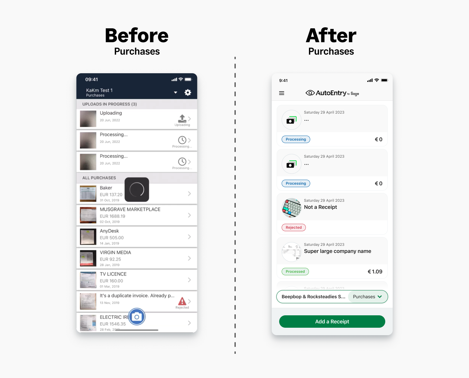
In this project you will get an insight into the updates to the AutoEntry mobile app product. A quick overview allows small business and accountants to upload receipts and invoices.
The mobile project consisted of the redesign for the AutoEntry App. We where tasked with a rebranding the mobile app, this also gave us an opportunity to update some key painpoints and improve some features. With the rebrand update Users where also getting some very useful feature updates.
The app itself is a simple product. You snap images of receipts, invoices and expenses. These are broken into 3 separate folders Purchases, Sales and Expenses. The core of the product is Purchases and Sales. The product is aimed at SME and Sole Traders, Bookkeepers and Accountants. How it works. You open the app take a snap of receipt and then it is processed. Data is attracted and can be connected to tax software products such as Sage for Accountants.
Some of the key goals that we focused on through the rebrand and redesign.
Fig above: Figma prototype of the receipt upload process minus the action sheet.
Users found the slower hand held approach using a action sheet in iOS to be more helpful than the faster alternative of mode selection with the camera functionality.
As opposed to the simple version above in the video.
Users preferred the version with the action sheet.
During this project we tested some of work we real world Users who where actively using the current / previous version of the product. Below you can see some tests that where carried out by our UX research Team. For the tests we created an A and B version of the mobile camera - upload process. We asked are participants in complete 3 tasks on both versions. Users where prompted to speak aloud whilst completing each task. Much to our surprise we found that the process where we prompted our Users with Actions Sheet (IOS Version) in selecting the upload method (Camera or Gallery). Rather than the more flexible/generic version with the Image icon in the bottom left side of the screen. Our Users preferred the more handheld process. The takeaways from this where that our Users felt more comfortable with some friction as it meant they had to decide what method they wanted to upload items in as a first step. We used this thinking to help simplify the rest of the process. Although there might be more steps from the previous version. We have received positive feedback from our Users that claim that the product has more clarity.
We found that in the alternative version which we gave more flexibility to the User to make adjustments(changing mode from single to multi-item upload or combined) after the Image was taken or item was selected from the gallery was not perceived as helpful. Below you can see the work we implemented after carrying out our research, which allowed us to make some better decisions about the camera and gallery upload flow and functionality.
Fig below: Figma mockups of the purchases page
The app is constantly evloving and improving. We are always working to improve the experience for our users. The current version will likely be a slight bit different to the below version.
More updates to come.
